Treat Yourself First
About The Client
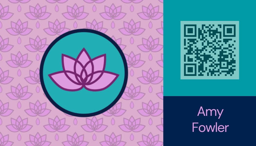
Treat Yourself First is an alternative and holistic health service. This health care professional focuses on intuitive energy healing, mental health, chronic pain, holistic healing, and intuition activation.
Collaboration
Branding and Social Media Content

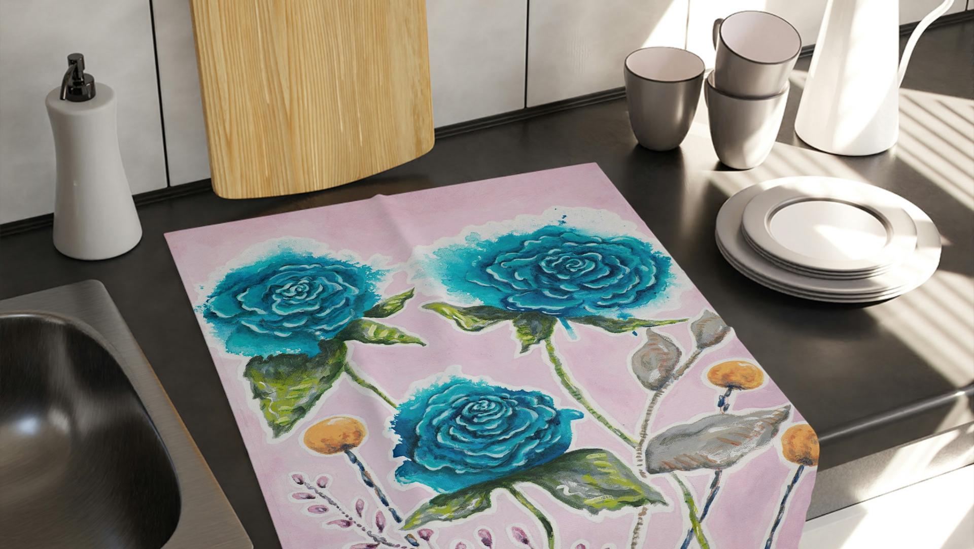
The Business Ensemble for Treat Yourself First focuses on overall health. Templates for social media and email provide the ease of updating information for each event as needed. Landing pages were created for funnels and email collection to help grow reach beyond social media.


True Currency
About The Client
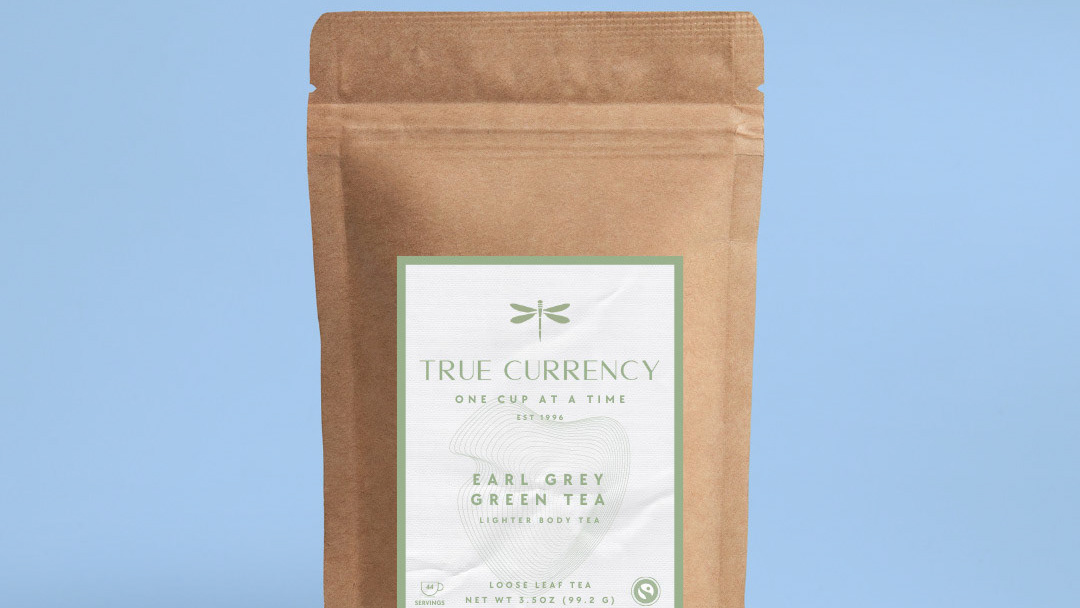
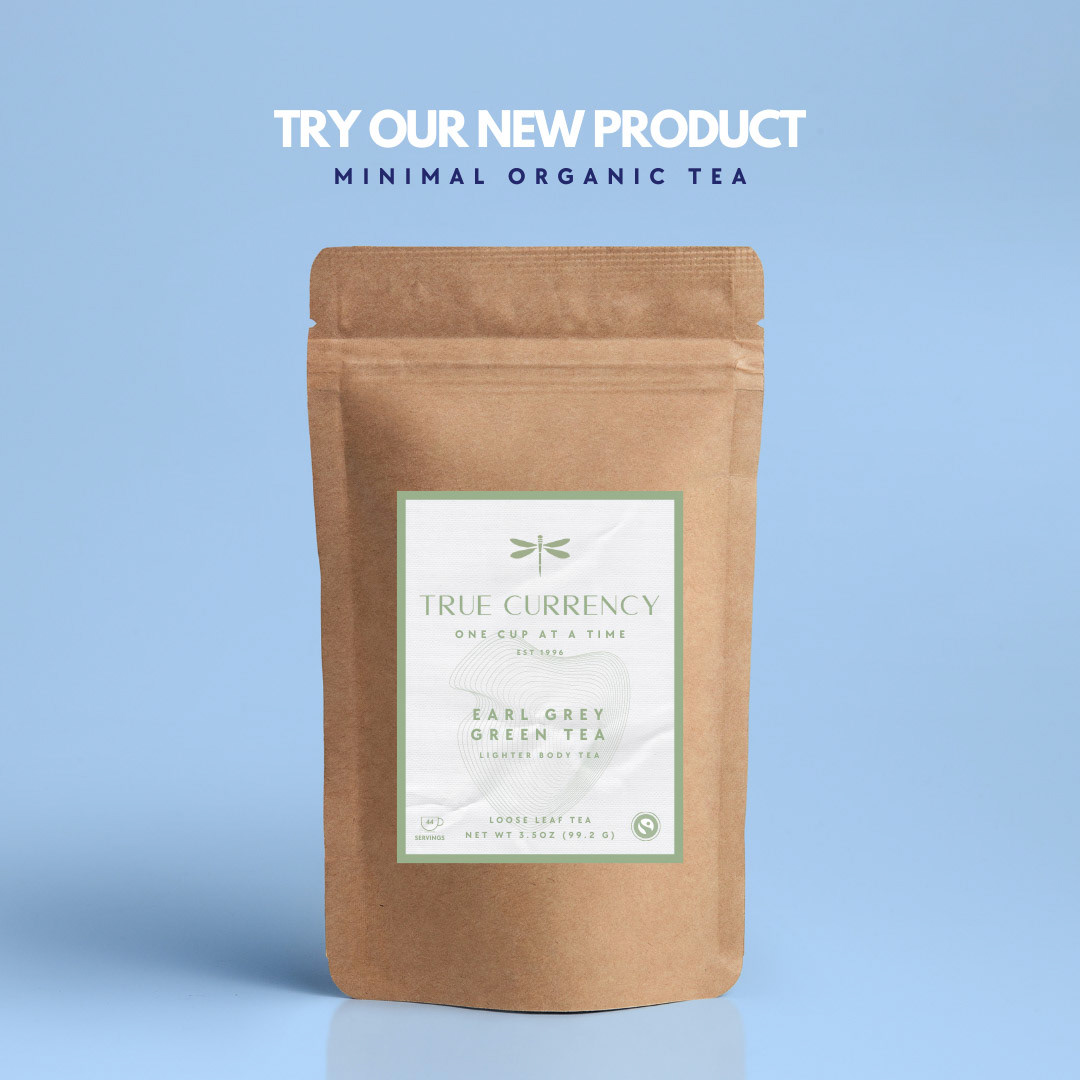
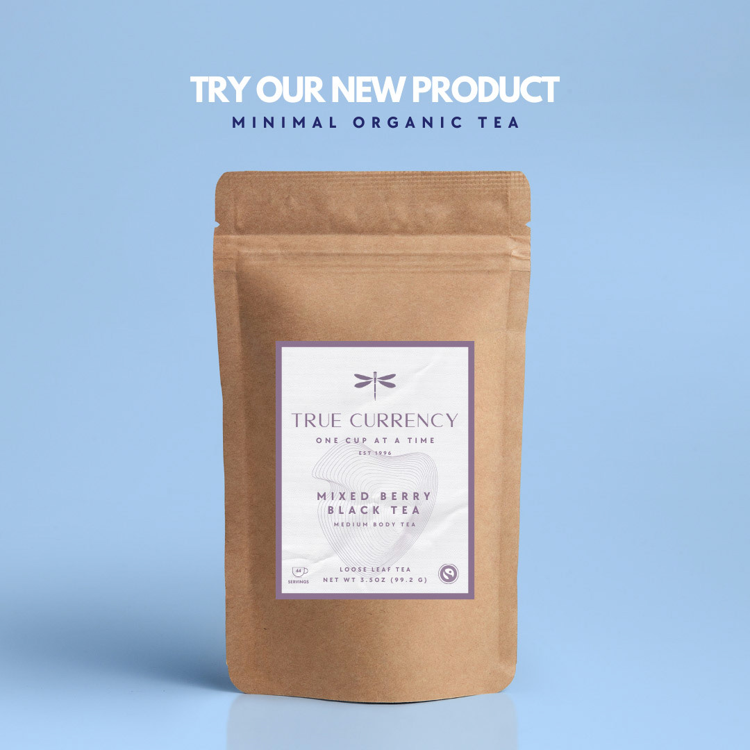
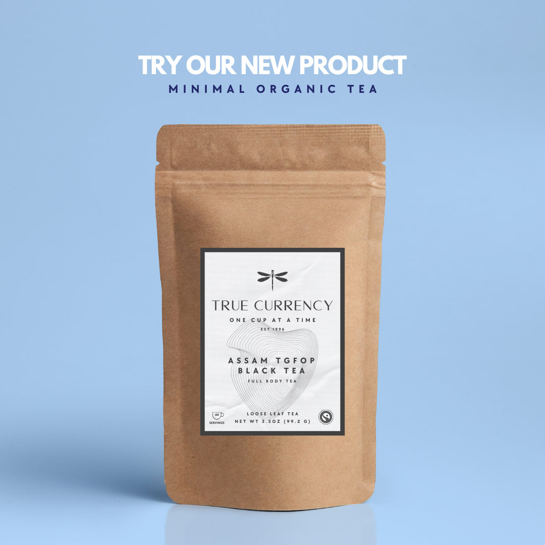
After extensive research into creating a clean, ethical, sustainable, and trustworthy business, I decided to establish a tea company, fueled by my passion for loose leaf tea. True Currency is a fictional brand I developed, inspired by the movie quote from Lester Bangs in Almost Famous: "The only true currency in this bankrupt world is what you share with someone else when you’re uncool."
Collaboration
Branding and Package Design
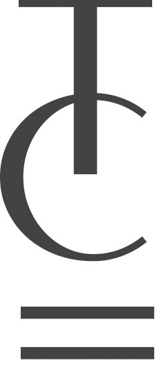
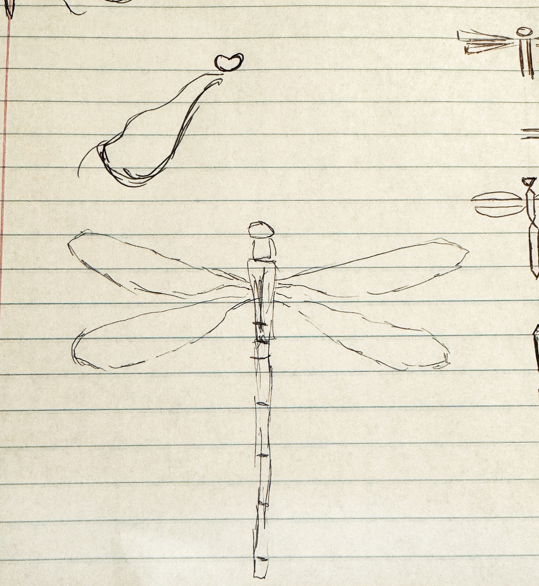
Concept: Honesty + Integrity = True Currency, an ethically sourced, clean, and eco-friendly brand. Dragonflies represent change and a mature perspective on transformation and longevity. The equal sign as the head symbolizes ethics of honesty + integrity, emphasizing the commitment to leaving the planet better than we found it. Below is a sketch of the original development of the dragonfly used in the logo, along with the thought process behind various iterations during the logo's development.


Below are concepts in developing the logo for True Currency.

Package Design: Compostable packaging adorned with an equally eco-friendly label. The design features a subtle graphic that mimics a thumbprint or tree rings, symbolizing our connection to the earth and the brand's commitment to leaving a minimal ecological footprint. The flowing lines of the graphic also resemble a topographical map, reinforcing our bond with nature.

Concera Media
About The Client
Concera is an internet marketing and PR agency based in Kansas City, Missouri. I worked closely with the client to create their vision for a logo and brand as they launched their business.
Collaboration
Logo Development


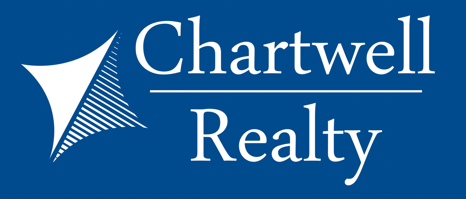
Chartwell Realty
About The Client
As a startup realty company, distinctive branding was crucial for Chartwell Realty. The client's initial concept featured a blue and yellow logo designed to catch the eye from the curb. We developed this logo to fulfill the client's request but also proposed an alternative: a timeless, monochromatic logo that emphasizes longevity and style.
Collaboration
Logo Development and Branding
Logo Design | Branding
Branding | Alternative Logo Option
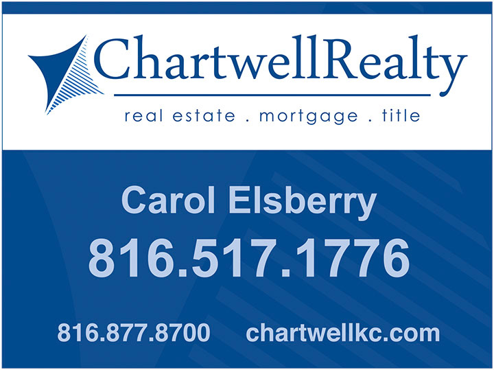
Realtor Yard Sign

Clients Original Concept
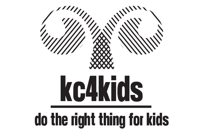
KC4Kids
About The Client
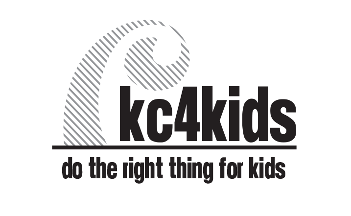
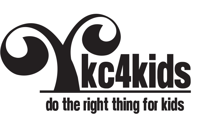
KC4Kids was developed to promote support for school aged children within the Kansas City, Missouri public school system.
Collaboration
Logo Development
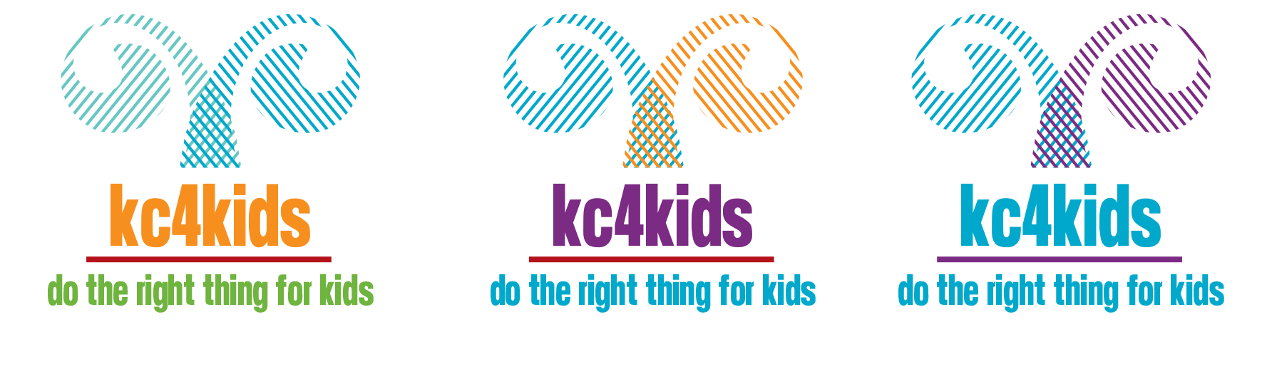
Kansas City is often referred to as "the city of fountains." Inspired by this nickname, I created a playful logo that conveys youthful energy through a vibrant color palette. The logo features a design reminiscent of a fountain-like tree, with each branch styled in a different color to create depth and movement. At the base of the tree, the overlapping colors form a grid pattern, symbolizing a strong anchor. This design represents the city's commitment to doing the right thing for its children, illustrating that the efforts are deeply rooted and dedicated to the well-being of the youth in Kansas City.
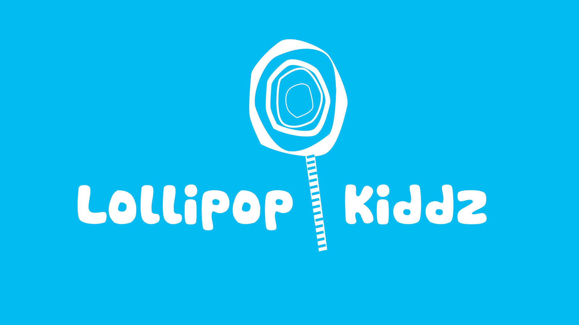
Lollipop Kiddz
About The Client
Lollipop Kiddz was created by a music teacher named Bonnie. Becoming a grandparent inspired Bonnie to come out of retirement to bond with her own grandchildren. She wrote and produced an entire album of children's music for babies and toddlers. Her target audience is grandparents who want to connect with their grandchildren, whether near or far.
Collaboration
Logo Development, Product Development, CD Package Design, Printing, and Merch


Gritty Golf Guide
About The Client
Gritty Golf Guide is dedicated to celebrating the 'grit' integral to the challenging game of golf. As a golf course architect, my client specializes in crafting golfing excursions that offer access to some of the most demanding courses worldwide. The Gritty Golf Guide promises a unique golfing experience, combining exclusive access to the world's greatest and most challenging courses with impeccable service in a relaxed atmosphere. Plus, you'll have the privilege of having your own personal golf course architect serve as your guide throughout the journey.
Collaboration
Branding and Logo Development
The challenge in creating this logo was embodying the gritty image described by my client. By conceptualizing the 'G' as a face, I crafted the letter into an animated grimace, perfectly capturing the frustration a golfer feels when tackling a difficult course.